Questions with Answers, Solution | Statistics | Chapter 6 | 8th Maths - Exercise 6.2 (Graphical Representation of the Frequency Distribution for Grouped Data) | 8th Maths : Chapter 6 : Statistics
Chapter: 8th Maths : Chapter 6 : Statistics
Exercise 6.2 (Graphical Representation of the Frequency Distribution for Grouped Data)
Exercise
6.2
1. Which of the following data can be
represented in a histogram?
(i) The number
of mountain climbers in the age group 20 to 60 in TamilNadu. [Answer: Yes]
(ii) Production
of cycles in different years. [Answer: No]
(iii) The
number of students in each class of a school. [Answer: No]
(iv) The
number votes polled from 7 am to 6 pm in an election. [Answer: Yes]
(v) The wickets
fallen from 1 over to 50th over in a one day cricket match. [Answer: Yes]
2. Fill in the blanks:
(i) The total
area of the histogram is ________ to the total frequency of the given data. [Answer: proportional]
(ii) A graph
that displays data that changes continuously over the periods of time is _____.
[Answer: Histogram]
(iii) Histogram
is a graphical representation of ___________ data. [Answer: grouped]
3. In a village, there are 570 people
who have cell phones. An NGO survey their cell phone usage. Based on this survey
a histogram is drawn. Answer the following questions.
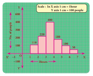
(i) How many people use the cell phone
for less than 3 hours?
Solution: 330 people (110 + 220)
(ii) How many of them use the cell phone
for more than 5 hours?
Solution: 150 of them (100 + 50)
(iii) Are people using cell phone for
less than 1 hour?
Answer: No.
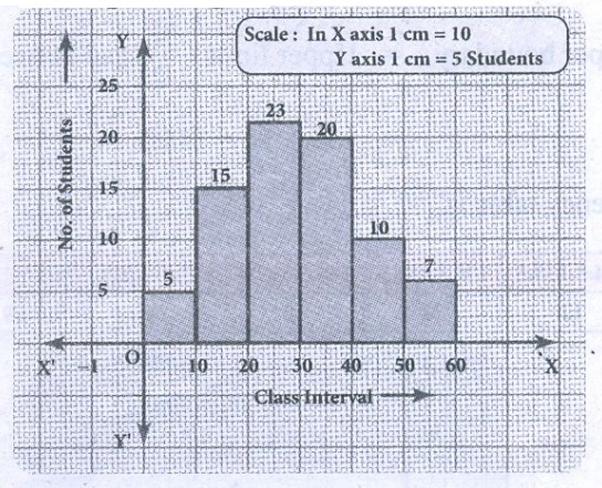
4. Draw a histogram for the following
data.
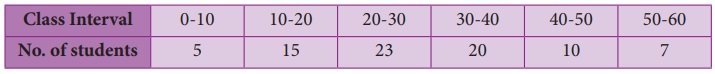
Solution:
The given data is continuous frequency distribution taking class
intervals on X axis and No. of students on Y−axis, the histogram is given
below.
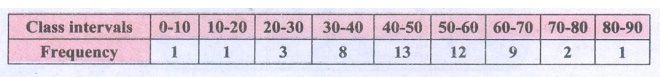
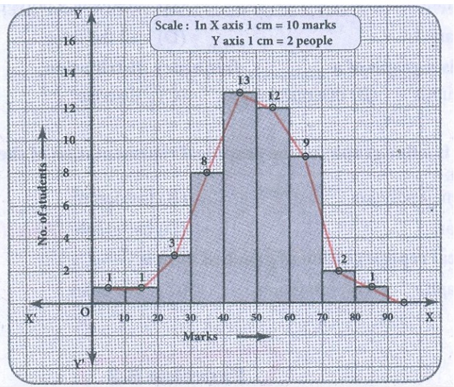
5. Construct a histogram from the following
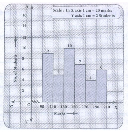
distribution of total marks of 40 students in a class.
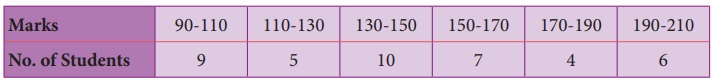
Solution:
The given distribution is continuous taking marks on X axis and
No. of students on Y−axis the histogram is constructed.
6. The distribution of heights ( in cm ) of 100 people is given below. Construct
a histogram and the frequency polygon imposed on it.
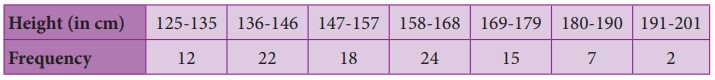
Solution:
The given distribution is discontinuous.
Converting into continuous distribution we have
Lower boundary = lower limit – 1/2 (gap between adjacent class
interval)
= 125 – 1/2 (1) = 124.5
Upper boundary = Upper limit + 1/2 (gap between the adjacent
class interval)
= 135 + 1/2 = 135.5
∴ The new frequency table is

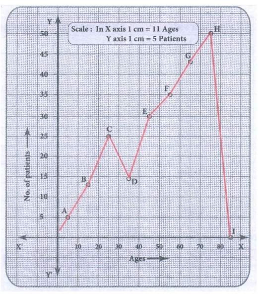
7. In a study of dental problem, the following
data were obtained.
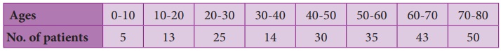
Represent the above data by a frequency polygon.
Solution:
Finding the midpoints of the class interval we get.
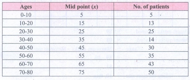
The points to be plotted are A (5,5), B (15, 13), C (25, 25), D
(35, 14), E (45, 30), F(55,35) G (65, 43.), H (75, 50) to obtain the frequency
polygon ZABCDEFGHI.
Where I imagined class between 80 and 90.
8. The marks obtained by 50 students
in Mathematics are given below (i) Make a frequency distribution table taking a
class size of 10 marks (ii) Draw a histogram and a frequency polygon.
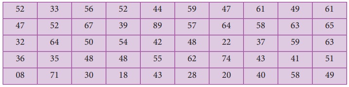
Solution:
Maximum marks obtained = 89
Minimum marks obtained = 08
Range = Maximum marks − Minimum
marks
= 89 – 08
= 81
Taking the class size = 10, then
Number of possible intervals = Range / Class size
= 81/10 = 8.1 = 9
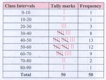
Now we have the continuous frequency table.
We will draw the histogram taking class interval in x axis and
frequency in y axis as follows.
Objective
Type Questions
9. Data is a collection of ________
(A) numbers
(B) words
(C) measurements
(D) all the
three
[Answer: (D) all the three]
10. The number of times an observation
occurs in the given data is called ________
(A) tally
marks
(B) data
(C) frequency
(D) none
of these
[Answer: (C) frequency]
11. The difference between the largest
value and the smallest value of the given data is ________
(A) range
(B) frequency
(C) variable
(D) none
of these
[Answer: (A) range]
12. The data that can take values between
a certain range is called________
(A) ungrouped
(B) grouped
(C) frequency
(D) none
of these
[Answer: (B) grouped]
13. Inclusive series is a ________series.
(A) continuous
(B) discontinuous
(C) both
(D) none
of these
[Answer: (B) discontinuous]
14. In a class interval the upper limit
of one class is the lower limit of the other class. This is ________series.
(A) Inclusive
(B) exclusive
(C) ungrouped
(D) none
of these
[Answer: (B) exclusive]
15. The graphical representation of ungrouped
data is ________
(A) histogram
(B) frequency
polygon
(C)pie chart
(D) all the
three
[Answer: (C) pie chart]
16. Histogram is a graph of a ________
frequency distribution.
(A) continuous
(B) discontinuous
(C) discrete
(D) none
of these
[Answer: (A) continuous]
17. A ________ is a line graph for the
graphical representation of the continuous frequency distribution.
(A) frequency
polygon
(B) histogram
(C) pie chart
(D) bar graph
[Answer: (A) frequency polygon]
18. The graphical representation of grouped
data is ________
(A) bar graph
(B) pictograph
(C) pie chart
(D) histogram
[Answer: (D) histogram]
Answer:
Exercise 6.2
1. (i) Yes (ii) No
(iii) No (iv) Yes (v) Yes
2. (i) Proportional
(ii) Histogram(iii) Grouped
3. (i) 330 (ii) 150
(iii) No
9. (d) all the three
10. (c) Frequency
11. (a) range
12. (b) grouped
13. (b) discontinuous
14. (b) Exclusive
15. (c) pie chart
16. (a) continuous
17. (a) frequency polygon
18. (d) histogram
Related Topics