Line Chart, Pie Chart and Bar Chart - Data Visualization Using Pyplot: Book Back Questions and Answers | 12th Computer Science : UNIT 16 : Integrating Python with MySql and C++ : Data Visualization Using Pyplot: Line Chart, Pie Chart and Bar Chart
Chapter: 12th Computer Science : UNIT 16 : Integrating Python with MySql and C++ : Data Visualization Using Pyplot: Line Chart, Pie Chart and Bar Chart
Data Visualization Using Pyplot: Book Back Questions and Answers
Evaluation
Part – I
Choose the best answer (1 Marks)
1.Which is a python package used for 2D graphics?
a. matplotlib.pyplot
b. matplotlib.pip
c. matplotlib.numpy
d. matplotlib.plt
2.Identify the package manager for Python packages, or modules.
a. Matplotlib
b. PIP
c. plt.show()
d. python package
3.Read the following code: Identify the purpose of this code and choose the right option from the following.
C:\Users\YourName\AppData\Local\Programs\Python\Python36-32\Scripts>pip – version
a. Check if PIP is Installed
b. Install PIP
c. Download a Package
d. Check PIP version
4.Read the following code: Identify the purpose of this code and choose the right option from the following.
C:\Users\Your Name\AppData\Local\Programs\Python\Python36-32\Scripts>pip list
a. List installed packages
b. list command
c. Install PIP
d. packages installed
5.To install matplotlib, the following function will be typed in your command prompt. What does “-U”represents?
Python –m pip install –U pip
a. downloading pip to the latest version
b. upgrading pip to the latest version
c. removing pip
d. upgrading matplotlib to the latest version
6. Observe the output figure. Identify the coding for obtaining this output.
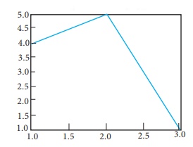
a. import matplotlib.pyplot as plt
plt.plot([1,2,3],[4,5,1])
plt.show()
b. import matplotlib.pyplot as plt
plt.plot([1,2],[4,5])
plt.show()
c. import matplotlib.pyplot as plt
plt.plot([2,3],[5,1])
plt.show()
d. import matplotlib.pyplot as plt
plt.plot([1,3],[4,1])
plt.show()
7. Read the code:
a. import matplotlib.pyplot as plt
b. plt.plot(3,2)
c. plt.show()
Identify the output for the above coding.
Answer: (C)
8.Which key is used to run the module?
a. F6
b. F4
c. F3
d. F5
9.Identify the right type of chart using the following hints.
Hint 1: This chart is often used to visualize a trend in data over intervals of time.
Hint 2: The line in this type of chart is often drawn chronologically.
a. Line chart
b. Bar chart
c. Pie chart
d. Scatter plot
10. Read the statements given below. Identify the right option from the following for pie chart.
Statement A: To make a pie chart with Matplotlib, we can use the plt.pie() function.
Statement B: The autopct parameter allows us to display the percentage value using the Python string formatting.
a. Statement A is correct
b. Statement B is correct
c. Both the statements are correct
d. Both the statements are wrong
Part - II
Answer the following questions (2 Marks)
1. Define: Data Visualization.
Ans. Data Visualization is the graphical representation of
information and data. The objective of Data Visualization is to communicate
information visually to users. For this, data visualization uses statistical
graphics. Numerical data may be encoded using dots, lines, or bars, to visually
communicate a quantitative message.
2. List the general types of data visualization.
Ans. (i) Charts
(ii) Tables
(iii) Graphs
(iv) Maps
(v) Infographics
(vi) Dashboards
3. List the types of Visualizations in Matplotlib.
Ans. There are many types of Visualizations under Matplotlib. Some
of them are:
(i) Line plot
(ii) Scatter plot
(iii) Histogram
(iv) Box plot
(v) Bar chart and
(vi) Pie chart
4. How will you install Matplotlib?
Ans. You can install the latest version of pip from your command
prompt using the following command.
Python-m pip install -U pip
5. Write the difference between the following functions: plt.plot([1,2,3,4]), plt. plot([1,2,3,4], [1,4,9,16]).
Ans.
plt.plot([l,2,3,4])
After installing Matplotlib, we will begin coding by importing
Matplotlib using the command: import matplotlib. pyplot as pIt
Now you have imported Matplotlib in your workspace.
You need to display the plots. Using Matplotlib from within a
Python script, you have to add plt.show() method inside the file to display
your plot.
plt.plot([l,2,3,4], [1,4,9,16])
A single list or array provided to the plot () command,
matplotlib assumes it is a sequence of y values, and automatically generates
the x values for you. Since python ranges start with 0, the default x vector
has the same length as y but starts with 0.
Hence the x data are [0, 1,2,3].
plot() is a versatile command, and will take an arbitrary number
of arguments.
This .plot takes many parameters, but the first two here are 'x'
and 'y' coordinates. This means, you have 4 co-ordinates according to these
lists: (1,1), (2,4), (3,9) and (4,16).
Part – III
Answer the following questions (3 Marks)
1. Draw the output for the following data visualization plot.
import matplotlib.pyplot as plt
plt.bar([1,3,5,7,9],[5,2,7,8,2], label="Example one")
plt.bar([2,4,6,8,10],[8,6,2,5,6], label="Example two", color='g')
plt.legend()
plt.xlabel('bar number')
plt.ylabel('bar height')
plt.title('Epic Graph\nAnother Line! Whoa')
plt.show()
Ans.
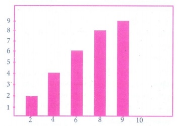
The above code represents the following
Lables → specifics labels for the bars.
Usage → Assign values to the labels specified.
Range → create sequence of numbers.
2. Write any three uses of data visualization.
Ans. (i) Data Visualization help users to analyze and interpret the
data easily.
(ii) It makes complex data understandable and usable.
(iii) Various Charts in Data Visualization helps to show
relationship in the data for one or more variables.
3. Write the coding for the following:
a. To check if PIP is Installed in your PC.
b. To Check the version of PIP installed in your PC.
c. To list the packages in matplotlib.
Ans. a. pip
b. pip—version
c. pip list
4. Write the plot for the following pie chart output.
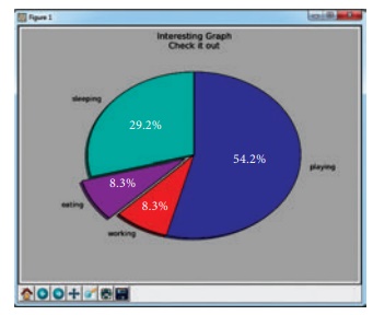
Ans. import matplotlib.pyplot as pit
val = [29.2, 54.2, 6.3, 8.35]
label = ["sleeping", "playing",
"working", eating"]
plt.pie (val, label = label)
plt.axes (). set_aspect
("equal")
plt.title ("Interesting Graph Check it out")
plt.show()
Part – IV
Answer the following questions (5 Marks)
1. Explain in detail the types of pyplots using Matplotlib.
Ans. Matplotlib allows you to create different kinds of plots
ranging from histograms and scatter plots to bar graphs and bar charts.
Line Chart:
(i) A Line Chart or Line Graph is a type of chart which displays
information as a series of data points called ‘markers’ connected by straight
line segments.
(ii) A Line Chart is often used to visualize a trend in data
over intervals of time - a time series - thus the line is often drawn
chronologically.
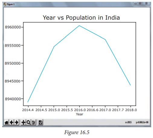
(iii) Program for Line plot:
import matplotlib.pyplot as pIt
years = [2014, 2015,
2016, 2017, 2018]
total_populations = [8939007, 8954518, 8960387,8956741, 8943721]
plt.plot (years, total_populations)
plt.title ("Year vs Population in India")
plt.xlabel ("Year")
plt.ylabel ("Total Population")
plt.show()
In this program,
Plt.title() → specifies title to the graph
Plt.xlabelO → specifies
label for X-axis
Plt.ylabel() → specifies
label for Y-axis
Output
Bar Chart:
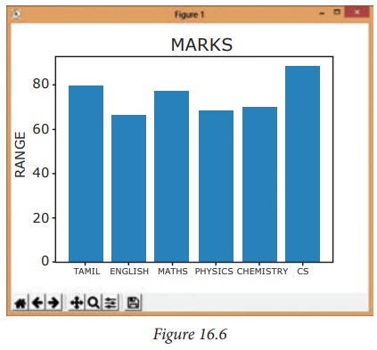
(i) A BarPlot (or BarChart) is one of the most common type of
plot. It shows the relationship between a numerical variable and a categorical
variable.
(ii) Bar chart represents categorical data with rectangular
bars. Each bar has a height corresponds to the value it represents. The bars
can be plotted vertically or horizontally.
(iii) It’s useful when we want to compare a given numeric value
on different categories. To make a bar chart with Matplotlib, we can use the
plt.bar() function.
(iv) Program :
import matplotlib.pyplot as pit
#Our data
labels = ["TAMIL", "ENGLISH",
"MATHS", "PHYSICS", "CHEMISTRY", "CS"]
usage = [79.8, 67.3, 77.8, 68.4, 70.2, 88.5]
#Generating the y positions. Later, we'll use them to replace
them with labels.
y_positions = range
(len(labels))
# Creating our bar plot
plt.bar (y_positions, usage)
plt.xticks (y_positions, labels)
plt.ylabel ("RANGE")
plt.title ("MARKS")
plt.show()
Output:
Pie Chart:
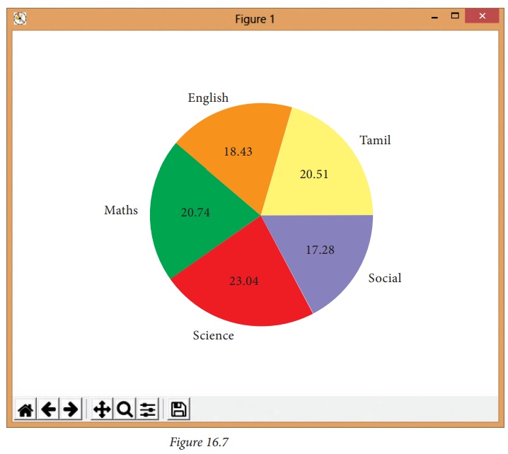
(i) Pie Chart is probably one of the most common type of chart.
It is a circular graphic which is divided into slices to illustrate numerical
proportion.
(ii) The point of a pie chart is to show the relationship of
parts out of a whole. To make a Pie Chart with Matplotlib, we can use the
plt.pie() function.
(iii) The autopct parameter allows us to display the percentage
value using the Python string formatting.
(iv) Program:
import matplotlib.pyplot as pit
sizes = [89, 80, 90,100, 75]
labels = ["Tamil", "English",
"Maths", "Science", "Social"]
plt.pie (sizes, labels = labels, autopct = "%2f")
plt.axes().set_aspect ("equal")
plt.show()
Output:
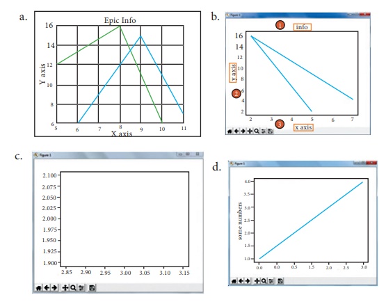
2. Explain the various buttons in a matplotlib window.
Ans.
Buttons in the output : In the output figure, you can see few buttons at the bottom
left corner. Let us see the use of these buttons.
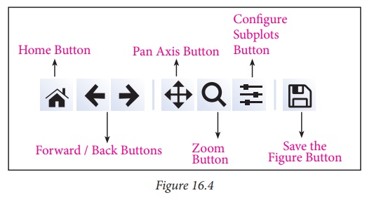
(i) Home Button → The
Home Button will help one to begun navigating the chart. If you ever want to
return back to the original view, you can click on this.
(ii) Forward/Back buttons
→ These buttons can be used like the Forward and Back buttons in browser. Click
these to move back to the previous point you were at, or forward again.
(iii) Pan Axis → This
cross-looking button allows you to click it, and then click and drag graph
around.
(iv) Zoom → The Zoom
button lets you click on it, then click and drag a square would like to zoom
into specifically. Zooming in will require a left click and drag. Zoom out with
a right click and drag.
(v) Configure Subplots → This button allows you to configure
various spacing options with figure and plot.
3. Explain the purpose of the following functions:
a. plt.xlabel
b. plt.ylabel
c. plt.title
d. plt.legend()
e. plt.show()
Ans. a. Specifies label for x-axis
b. Specifies label for y-axis
c. Specifies title to the graph or assigns the plot title.
d. Invoke the default legend with pit
e. Display the plot
Related Topics